
Context
Spinel is an innovative initiative at the intersection of health and building. Physiotherapists and occupational therapists go directly to construction sites to assess the physical condition of workers, ensuring their well-being and compliance with safety standards. This unique social project combines medical skills with the construction environment, highlighting the essential link between human development and industry to build a sustainable future.
Spinel is an innovative initiative at the intersection of health and building. Physiotherapists and occupational therapists go directly to construction sites to assess the physical condition of workers, ensuring their well-being and compliance with safety standards. This unique social project combines medical skills with the construction environment, highlighting the essential link between human development and industry to build a sustainable future.
Spinel is an innovative initiative at the intersection of health and building. Physiotherapists and occupational therapists go directly to construction sites to assess the physical condition of workers, ensuring their well-being and compliance with safety standards. This unique social project combines medical skills with the construction environment, highlighting the essential link between human development and industry to build a sustainable future.
My mission
My mission was to design a visual identity that reflects both the human and calming aspects of the project while conveying its innovative and concrete character. The goal was to communicate values of vitality, health, and altruism in order to attract the attention of construction companies and beneficiary workers.
My mission was to design a visual identity that reflects both the human and calming aspects of the project while conveying its innovative and concrete character. The goal was to communicate values of vitality, health, and altruism in order to attract the attention of construction companies and beneficiary workers.
My mission was to design a visual identity that reflects both the human and calming aspects of the project while conveying its innovative and concrete character. The goal was to communicate values of vitality, health, and altruism in order to attract the attention of construction companies and beneficiary workers.
SEARCH
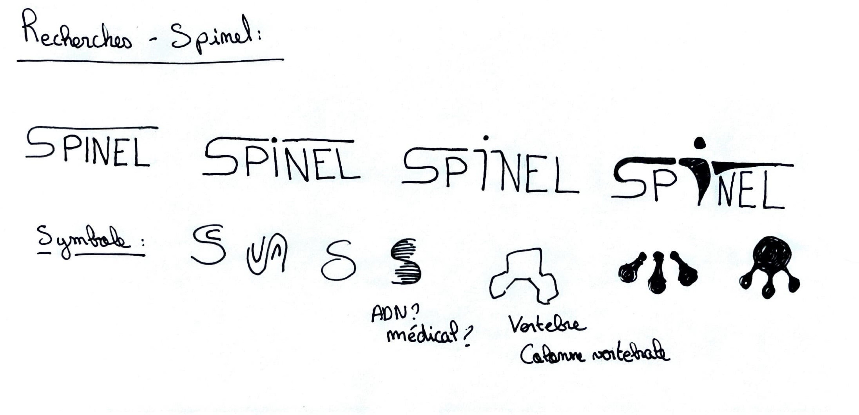
To define the values of the brand and thus the artistic direction to be taken, a brainstorming workshop was set up in the form of a word cloud.
To define the values of the brand and thus the artistic direction to be taken, a brainstorming workshop was set up in the form of a word cloud.
To define the values of the brand and thus the artistic direction to be taken, a brainstorming workshop was set up in the form of a word cloud.
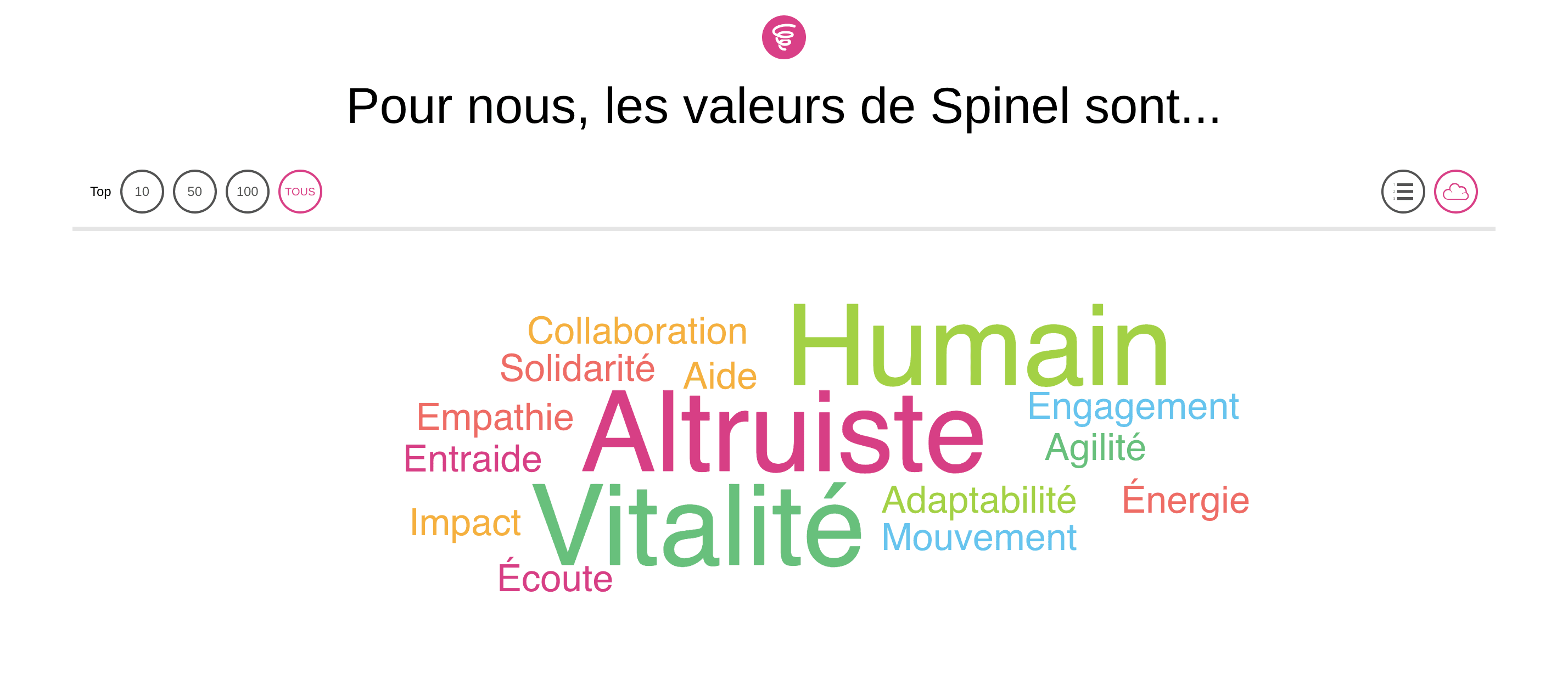
Selected values:
Vitality
Human
Altruistic
Target clients:
The construction companies, whether major or subcontractors, with a significant workforce.
Selected values:
Vitality
Human
Altruistic
Target clients:
The construction companies, whether major or subcontractors, with a significant workforce.
Selected values:
Vitality
Human
Altruistic
Target clients:
The construction companies, whether major or subcontractors, with a significant workforce.
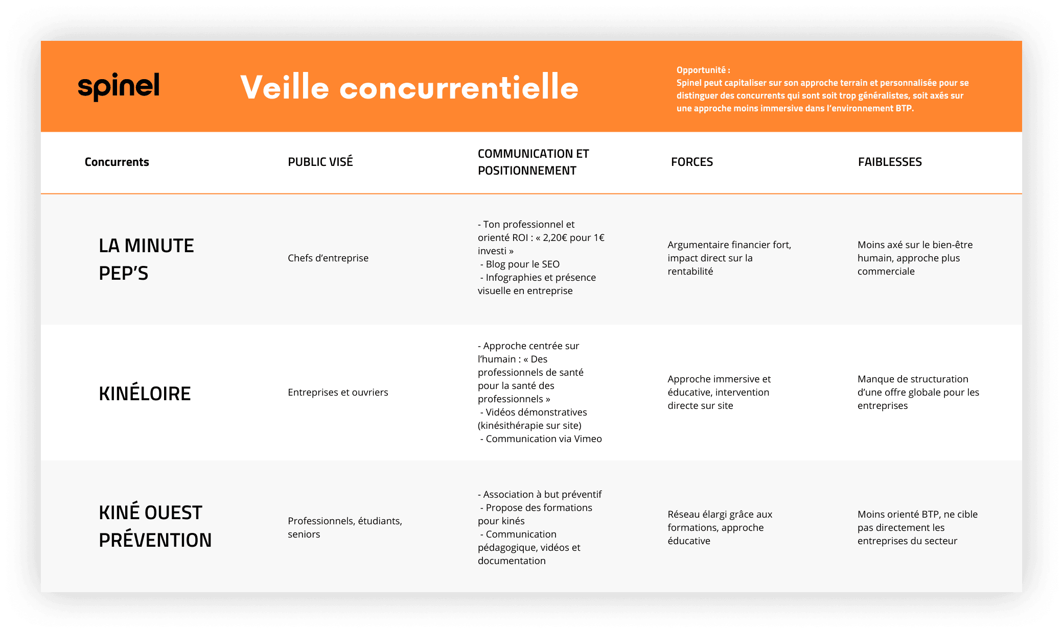
To accurately understand the needs of construction companies and workers, I conducted a competitive monitoring of competitors targeting the same audience and offering similar services. This exploratory phase helped identify the expectations of stakeholders. These insights guided the design of the graphic identity by ensuring its alignment with the project's vision.
To accurately understand the needs of construction companies and workers, I conducted a competitive monitoring of competitors targeting the same audience and offering similar services. This exploratory phase helped identify the expectations of stakeholders. These insights guided the design of the graphic identity by ensuring its alignment with the project's vision.
To accurately understand the needs of construction companies and workers, I conducted a competitive monitoring of competitors targeting the same audience and offering similar services. This exploratory phase helped identify the expectations of stakeholders. These insights guided the design of the graphic identity by ensuring its alignment with the project's vision.
Ideation
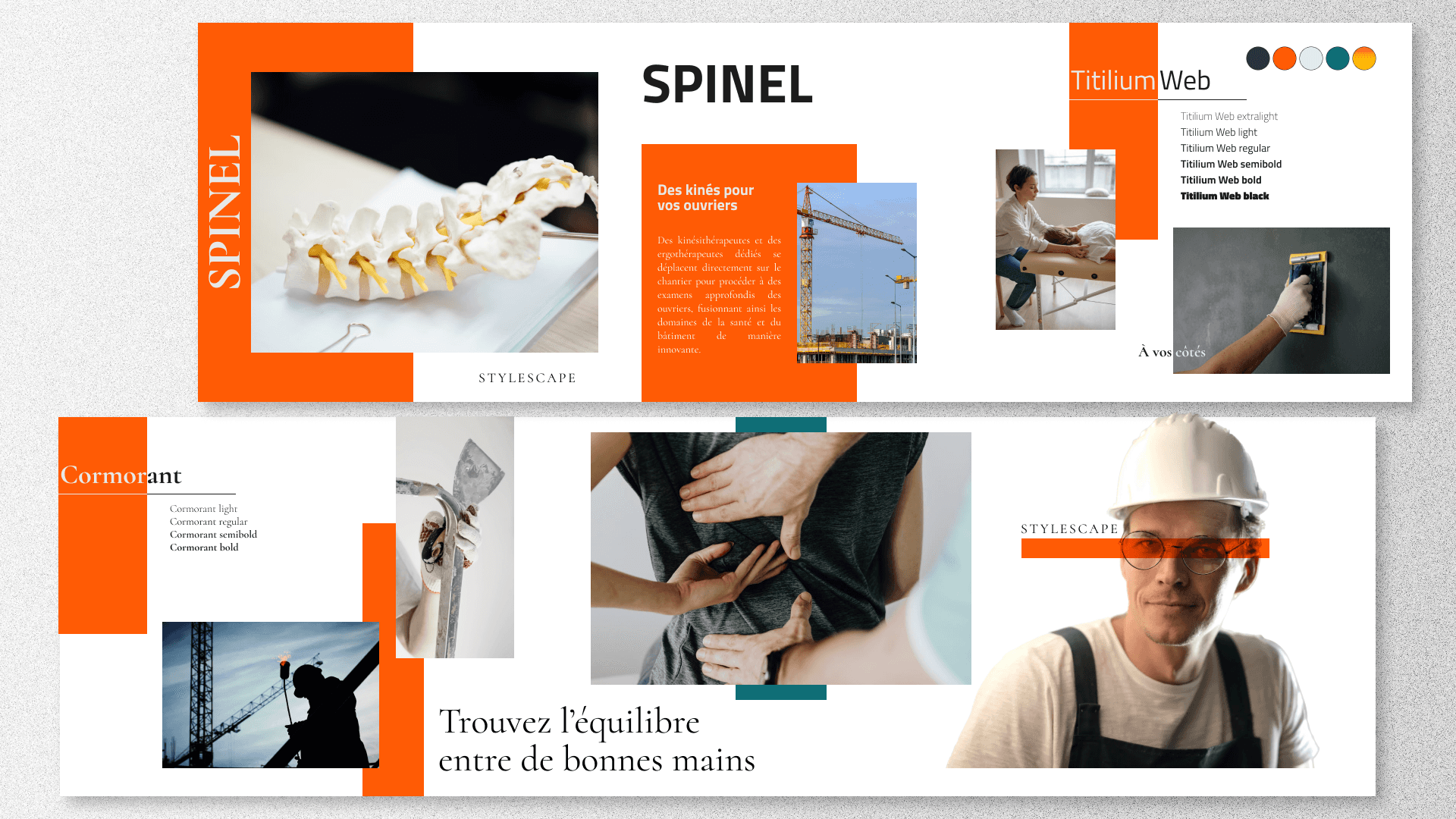
The visual identity was meant to convey the union between health and building, while offering a sense of comfort and safety.
Graphic choices:
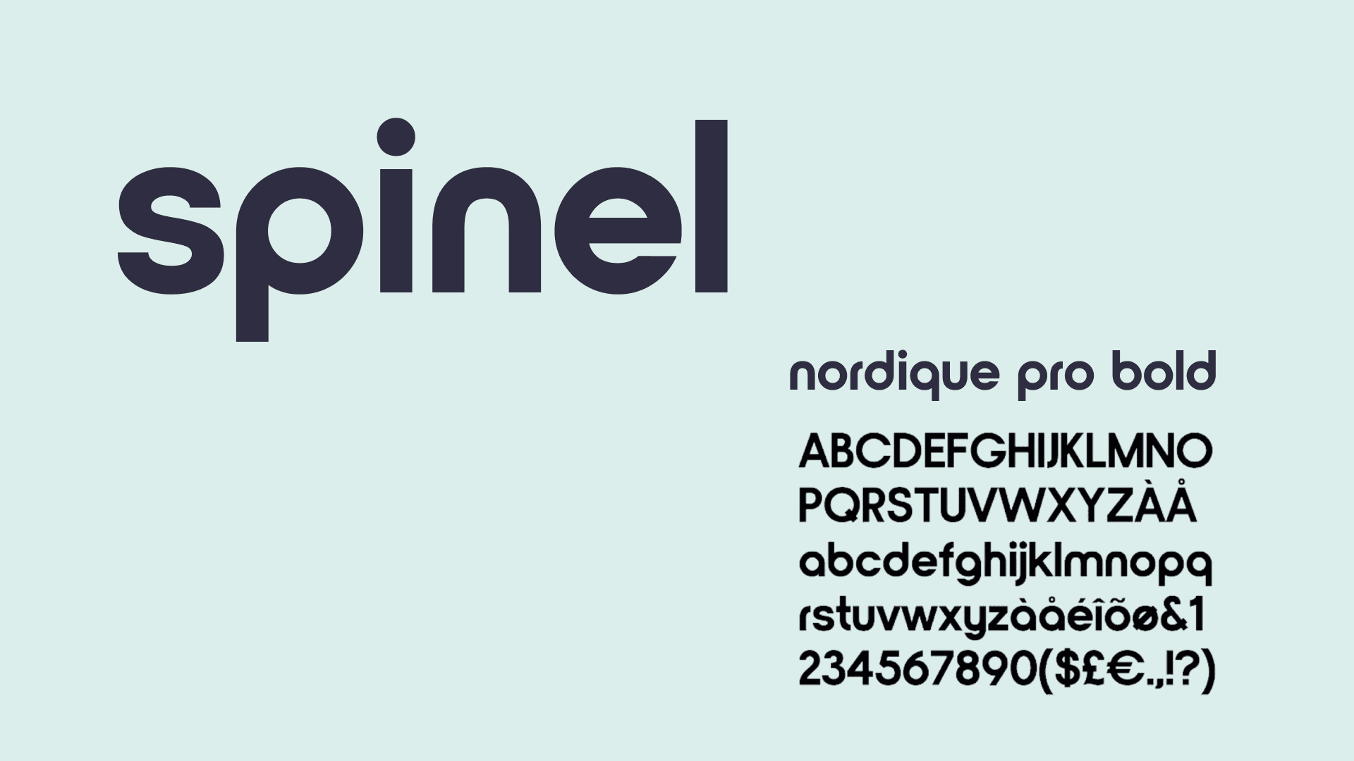
Typography: A modern and clean font, ensuring readability and professionalism.
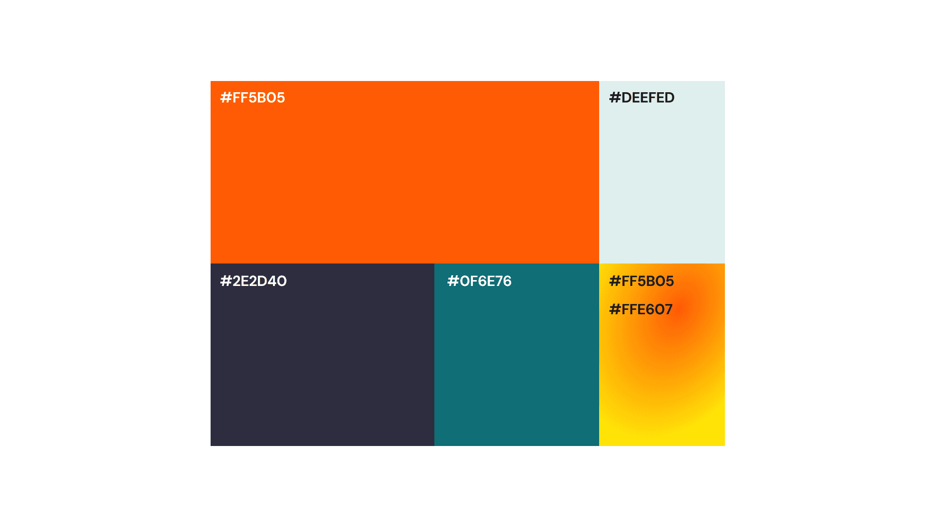
Color palette:
Light blue: Symbolizes health and serenity.
Green and orange: Represent vitality and well-being.
Gray: Adds a dimension of professionalism and stability.
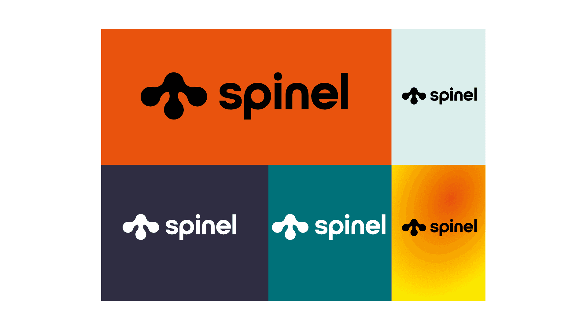
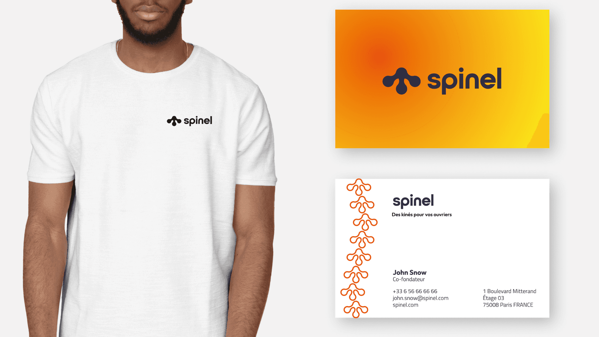
Visual elements:
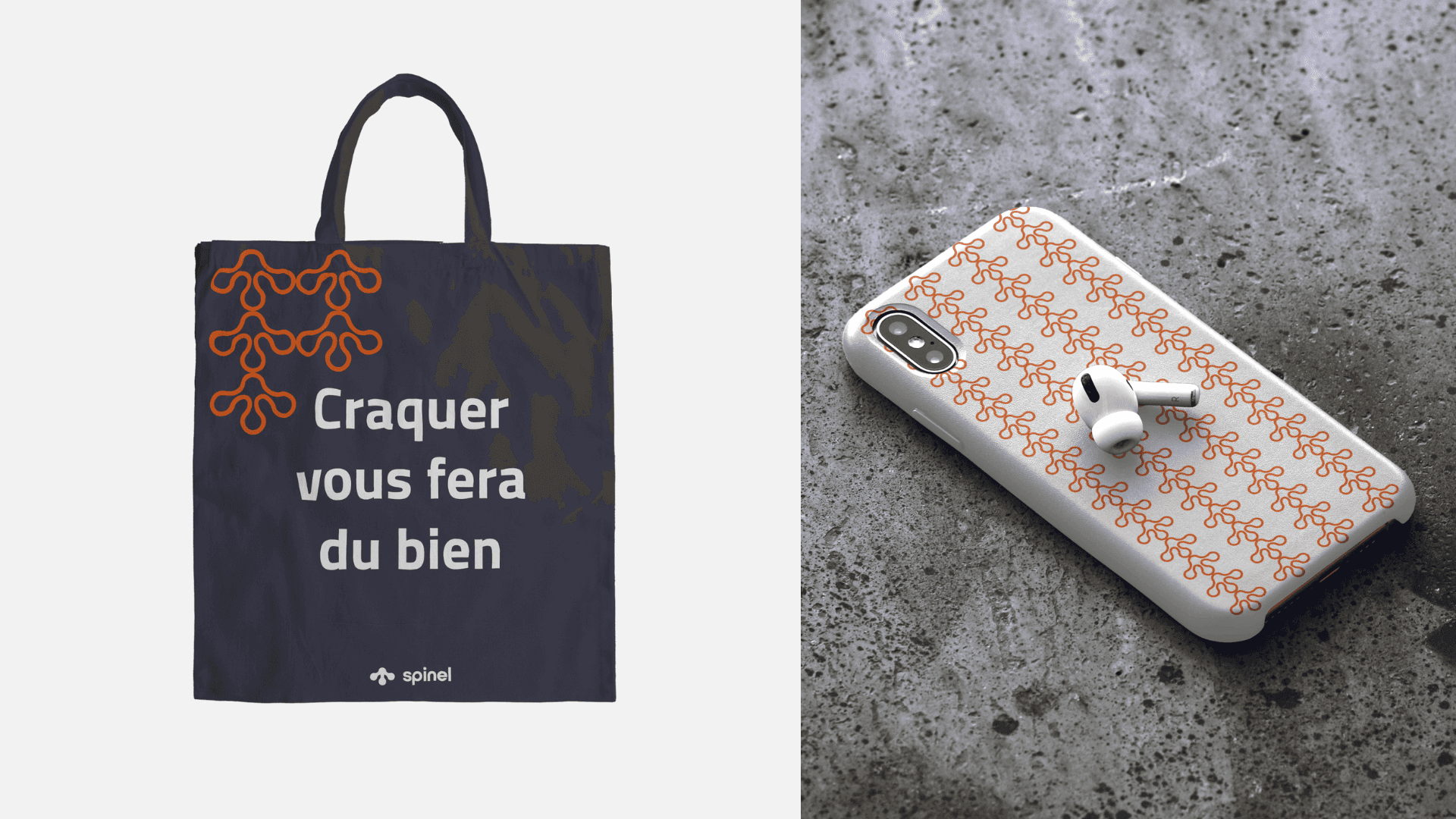
A distinctive logo adaptable to communication materials.
Print materials (posters, business cards) incorporating harmonious graphic elements.
The visual identity was meant to convey the union between health and building, while offering a sense of comfort and safety.
Graphic choices:
Typography: A modern and clean font, ensuring readability and professionalism.
Color palette:
Light blue: Symbolizes health and serenity.
Green and orange: Represent vitality and well-being.
Gray: Adds a dimension of professionalism and stability.
Visual elements:
A distinctive logo adaptable to communication materials.
Print materials (posters, business cards) incorporating harmonious graphic elements.
DESIGN
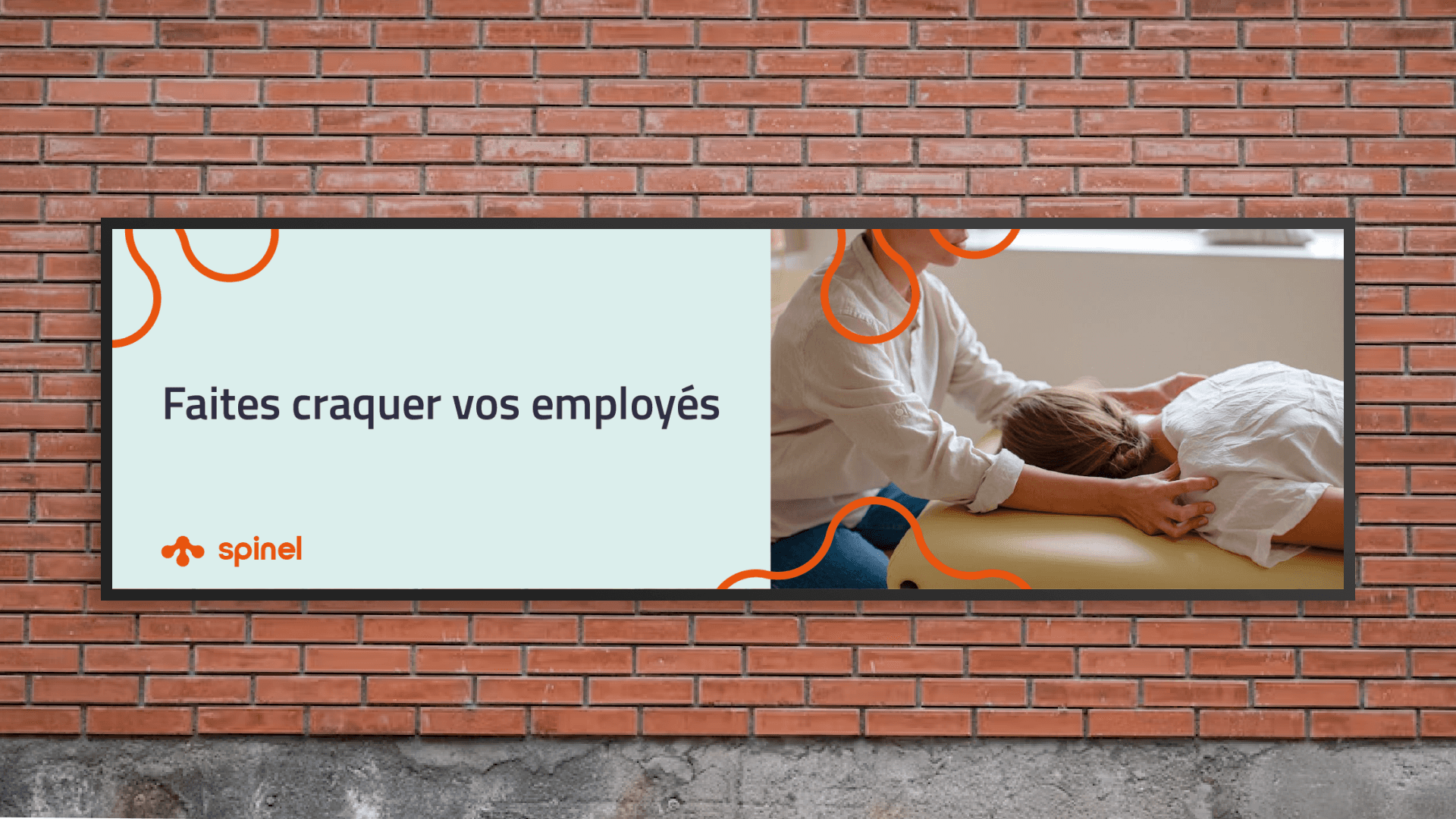
The visual universe of Spinel was intended to convey a soothing and human atmosphere, while reinforcing its message to companies and workers. All communication materials were designed to maximize the visual impact and capture the attention of the target audience.
The visual universe of Spinel was intended to convey a soothing and human atmosphere, while reinforcing its message to companies and workers. All communication materials were designed to maximize the visual impact and capture the attention of the target audience.
The visual universe of Spinel was intended to convey a soothing and human atmosphere, while reinforcing its message to companies and workers. All communication materials were designed to maximize the visual impact and capture the attention of the target audience.
Implementation
An acceptability and external validation test was conducted during a competition for student entrepreneurs, where Spinel's visual identity was presented. This evaluation allowed us to measure the impact of branding, the clarity of the message, and its alignment with the project’s values.
An acceptability and external validation test was conducted during a competition for student entrepreneurs, where Spinel's visual identity was presented. This evaluation allowed us to measure the impact of branding, the clarity of the message, and its alignment with the project’s values.
An acceptability and external validation test was conducted during a competition for student entrepreneurs, where Spinel's visual identity was presented. This evaluation allowed us to measure the impact of branding, the clarity of the message, and its alignment with the project’s values.