
Context
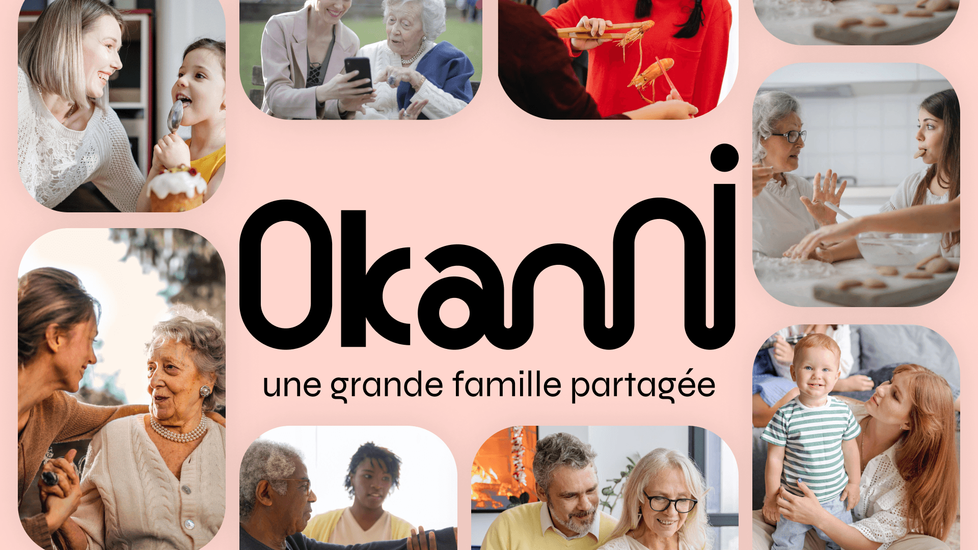
Okanni, meaning "at home" in Soninké, is much more than just an intergenerational habitat. It is a place where every moment of life, from growth to old age, is experienced in a soothing atmosphere conducive to well-being. This innovative concept meets the needs of elderly people seeking help and companionship, while also integrating other profiles such as single-parent families and students.
Okanni, meaning "at home" in Soninké, is much more than just an intergenerational habitat. It is a place where every moment of life, from growth to old age, is experienced in a soothing atmosphere conducive to well-being. This innovative concept meets the needs of elderly people seeking help and companionship, while also integrating other profiles such as single-parent families and students.
Okanni, meaning "at home" in Soninké, is much more than just an intergenerational habitat. It is a place where every moment of life, from growth to old age, is experienced in a soothing atmosphere conducive to well-being. This innovative concept meets the needs of elderly people seeking help and companionship, while also integrating other profiles such as single-parent families and students.
My mission
My mission was to create a memorable and attractive visual identity for Okanni, in order to stand out in a fairly tense real estate market. Conveying the core values of the brand through thoughtful and engaging design, to attract and retain potential residents.
My mission was to create a memorable and attractive visual identity for Okanni, in order to stand out in a fairly tense real estate market. Conveying the core values of the brand through thoughtful and engaging design, to attract and retain potential residents.
My mission was to create a memorable and attractive visual identity for Okanni, in order to stand out in a fairly tense real estate market. Conveying the core values of the brand through thoughtful and engaging design, to attract and retain potential residents.
SEARCH
To fully understand the needs and expectations of potential residents of Okanni, a series of interviews and field research were conducted. This exploratory phase allowed us to identify the brand's core values and to define a clear direction for the design.
To fully understand the needs and expectations of potential residents of Okanni, a series of interviews and field research were conducted. This exploratory phase allowed us to identify the brand's core values and to define a clear direction for the design.
To fully understand the needs and expectations of potential residents of Okanni, a series of interviews and field research were conducted. This exploratory phase allowed us to identify the brand's core values and to define a clear direction for the design.


Ideation
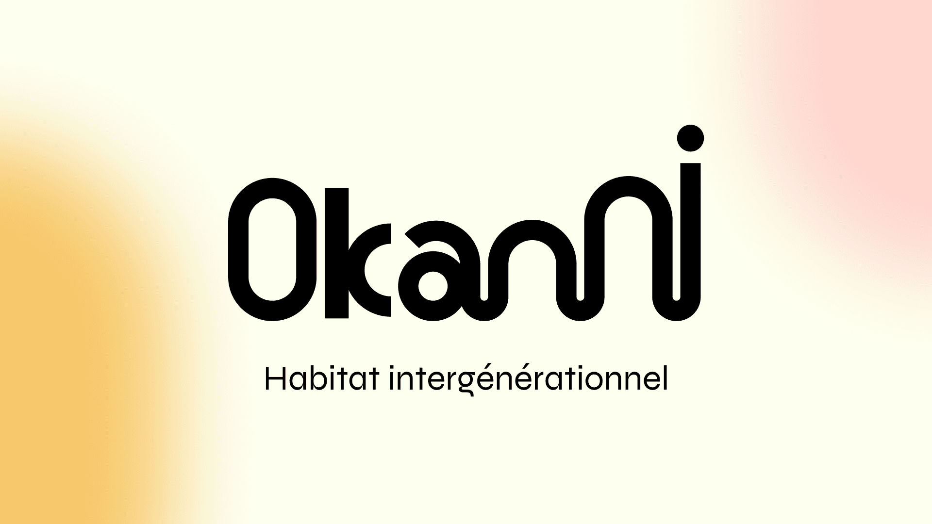
The Okanni logo was designed to reflect unity and community. Here are the key elements of the design:
Typography: A rounded and fluid typography was specially created for the logo, symbolizing softness and the connection between residents.
Connected Letters: The letters of the logo are interconnected, evoking unity and solidarity among generations.
Color Palette: The ochre and pink colors were chosen for their ability to evoke security and comfort, essential feelings for an intergenerational habitat.
Brand Values:
Solidarity
Mutual Aid
Kindness
Aging Well in Community
Sharing


DESIGN
The visual universe of Okanni has been developed in line with the brand's values. Soft and welcoming graphic elements have been integrated to create a warm and caring visual identity. Communication materials, such as brochures, posters, and the website, use this visual identity to convey a clear and engaging message.
The visual universe of Okanni has been developed in line with the brand's values. Soft and welcoming graphic elements have been integrated to create a warm and caring visual identity. Communication materials, such as brochures, posters, and the website, use this visual identity to convey a clear and engaging message.
The visual universe of Okanni has been developed in line with the brand's values. Soft and welcoming graphic elements have been integrated to create a warm and caring visual identity. Communication materials, such as brochures, posters, and the website, use this visual identity to convey a clear and engaging message.


Implementation
Verification and iteration to ensure that the graphic identity is aligned with the brand values and the intended message.
Verification and iteration to ensure that the graphic identity is aligned with the brand values and the intended message.
Verification and iteration to ensure that the graphic identity is aligned with the brand values and the intended message.


